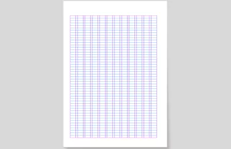
Layout grid
Layout grid
Layout grid
Different design rules apply depending on the product. For instance, bigger margins for printed materials, different proportions for portrait and landscape layouts, etc. However, the layout grid is a basic principle that applies to all products.
Margins and columns
In general, margins are equal on all sides at 5% (rounded to the next lower percentage) of the short side of the item. Example: A4’s short side is 210 mm, 5% of that is 10,5 mm, rounded down 10 mm.
Type area of a DIN A4 portrait brochure
- Top (head): 30 mm, bottom (foot) 20 mm
- Inside (gutter): 14 mm, outside (side margin): 21 mm
- No. of columns: 12, column spacing 3.5 mm
- Always use 12 columns. It is not only a connection to the 12-degree element, it also creates great flexibility in the layout. Generally, a gutter of half the margin’s size is used (continuing the above example, that will give us a 5 mm gutter).
- The Demag logo is usually placed in the bottom-right corner, respecting the margins.
- On ads and brochure covers, the main visual element shall fill almost the entire page, bleeding off top, bottom and left. On the right side, it is cut off in a 12-degree angle. This cut runs along the line of the logo’s whitespace.
Your Contact

Demag Global Marketing
Demag Global Marketing
Postfach 67
58286 Wetter
Germany
Phone:
+49 (0) 2335 92-3907
Fax:
+49 (0) 2335 92-53907
Email:
marketing@demagcranes.com


